Hope Labs Logo Design Process
Introduction
Over the last weeks we redesigned our logo to strengthen our brand. This process is common for young organisations trying to differentiate themselves from the rest and for mature companies that try to stay relevant. Logos can communicate swiftly the goals and values of an organisation and are the core component of brand identity. For this reason, reimagining a logo can be a daunting task too. Frequently, the first question we are asked by organisations we work with is: where can we get started? If you have ever struggled with your logo design, this article is for you. We want to show you step-by-step how we did it.
Our design process can effectively be broken down in three steps: identification, creation, evaluation. As in every design process, there is also an element of repetition. You need to go through a few iterations to obtain the results you want. In our case, we went through the “creation” phase five times ending up with different alternatives to choose from during the final evaluation. In the following sections, we have summarised the creative process that led us to our current design.
I. Identification
The objective of the identification process is to define who your audience is and what you want to communicate. It only makes sense to start sketching once these two fundamental questions have been answered.
Hope Labs, our company, aims to work alongside other social enterprises and charities. Therefore, Hope Labs needs to inspire trust in decision-makers: charity trustees and executives of social enterprises. Further research in the demographics of our audience led us to identify that most trustees fall within 55-65 years old, hold a professional qualification of some sort and spend on average 5 hours a week on their duties. To us, this meant that Hope Labs needs a bespoke professional logo design to stand out at the first impression.
Focusing on the message to communicate, Hope Labs offers support services to all kinds of social ventures. Therefore, communicating our values and what we stand for is extremely important. The component of mutual aid and the hope of a better world acquires considerable importance, so much so it was decided to represent them in the logo design.
II. Creation
This phase is all about creativity. We like using different brainstorming techniques to generate several ideas before shortlisting the best ones.
The first, and most important, step is to decide what the logo should stand for. In the previous paragraph, we highlighted the importance of “mutual aid” and “hope of a better tomorrow” for Hope Labs. Our research on symbolic representations of these abstract concepts led us to identify familiar icons to start playing and draw inspiration from.
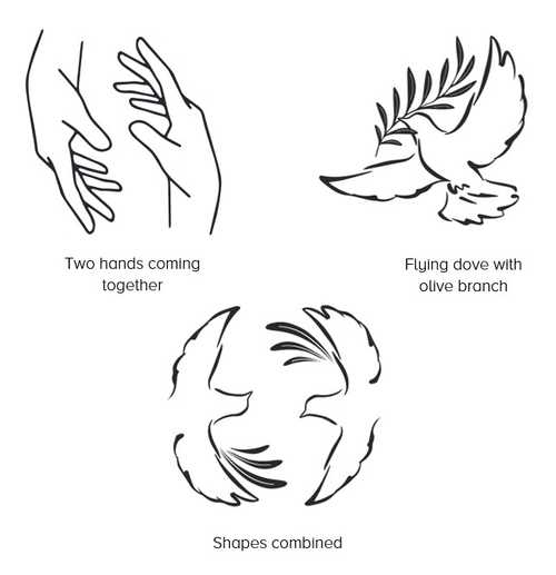
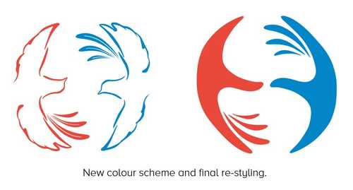
Two hands coming together is a universal symbol of humanitarian aid and a white dove carrying an olive branch is associated with hope and peace. These icons have a rich history in Western culture. For instance, Pablo Picasso popularised the dove as a messenger of peace in many of his works post 1949 and it is also used as a mascot by the World Peace Council. To capture our values, we designed combined the two symbols. We organised the elements in a circumference to convey the idea of movement, dynamism, and constant change. The two doves coming together also form a monogram of the letter “H”.
Colour combinations can be used to express emotions. The orange-red colour is associated with energy, passion, and enthusiasm: the perfect colour for a start-up like Hope Labs. It will help us bring attention to the stories of charities and social enterprises that partner with us. On the other hand, blue is linked to consciousness and intellect, and is a calming colour suitable to represent Hope Labs’ commitment and professionalism.
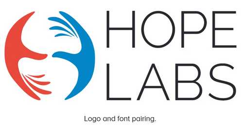
The best time to pick a font that will fit with a logo harmoniously is when the design of the logo is close to completion. We decided to use an elegant and geometric sans-serif typeface, designed in a single thin weight. Out of many fonts with these characteristics, we picked “Raleway” for its simplicity and clean look that can inspire a sense of trust and transparency.
III. Evaluation
Once you have one (or more) logo candidates, it is time to rate each one against the requirements highlighted during the identification phase. Ideally, the evaluation should be structured and value the feedback of people inside and outside your organisation. To help you in the evaluation, you can use a table to make sure that, for every design, you have assigned scores for all relevant features and requirements. At this stage, it is very important to be patient and thorough. If none of the designs under review is ready, take the time to polish it. A new logo is something that your organisation should be proud of. Our evaluation process led us to eliminate many ideas at different stages of development.
Here are some examples of our early designs that we abandoned.


